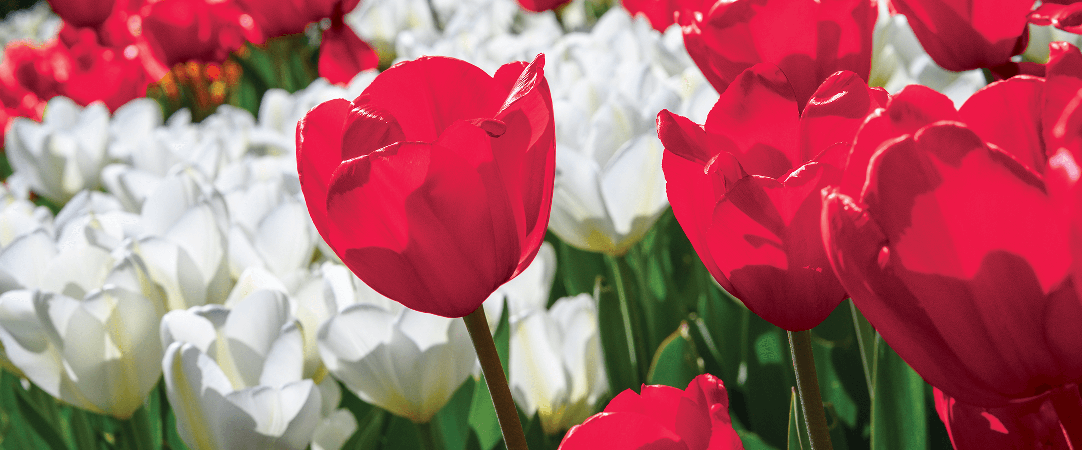
I was recently looking at UW–Madison’s brand and visual identity guide — you do this sort of thing from time to time, when you work for campus magazines — and saw something strange. The section that discusses the university’s primary colors noted that they’re Badger Red and white. White is fine, of course, but what is Badger Red? For more than a century, the UW’s school colors have been cardinal and white. The university’s oldest student newspaper is the Daily Cardinal, not the Daily Badger Red.
Cardinal is specific; red is generic. When we’re at a sporting event, we want to be sure that we cheer for the right team. Root for the cardinal and white, and you know you’re backing the UW, not Indiana (crimson and cream), Nebraska (scarlet and cream), Ohio State (scarlet and gray), Rutgers (scarlet and white), or Maryland (Maryland red and white, as well as gold and gray and a brownish shade called “Bronze Testudo”).
The UW formally adopted cardinal as its primary color in … well, actually, nobody is really certain when the UW chose cardinal as its chief color, or why. A short note in a 1944 issue of the Wisconsin Alumnus — forerunner to On Wisconsin — asked readers if they knew anything about that history. “A request for information about the origin of the University of Wisconsin’s colors (cardinal and white) has been routed to this office, and we can find no definite answer to the question, either,” the note reads. “The university had a color as early as 1881, but what it was or why has not been noted in any university history.”
It wasn’t a hopeless request. In 1944, Badgers who had been students in 1881 would have been in their 80s — some should still have been alive. But if any wrote in to offer information, those notes were neither recorded nor published. The question arose again in 1999, when the Wisconsin Alumni Association life memberships of every class of 1881 grad would have expired[MP1] . Then, UW historian Art Hove ’56, MA’67 concluded that cardinal and white were “generally accepted” as the UW’s colors by the 1880s. His reasoning seems solid. The Daily Cardinal published its first issue in 1892, which means cardinal must have been the school’s assumed color before that time.
Over the decades, cardinal has regularly proclaimed the university’s identity: on Homecoming decorations and at alumni gatherings, on T-shirts and architectural elements and Bucky figurines.
“Our official color is cardinal red,” says Danielle Lamberson Philipp, UW–Madison’s art director, “but on campus we call it ‘Badger Red.’ We’re trying to tie it to our brand.”
Branding is valuable, of course. After the university secured a trademark for Bucky in 1991, it licensed that piece of its brand and leveraged it to earn significant revenue — more than $1 million in 1994, the year the Badgers won their first Rose Bowl victory.
Lamberson Philipp is one of the guardians of UW–Madison’s brand colors. Twice a year, she and her colleagues offer a workshop called Brand 101 to help the campus community know how best to represent the classic cardinal. If you want to properly display your UW devotion, here are the cardinal rules.
Primary Colors
Badger Red — the cardinal shade of UW–Madison’s official brand — can be defined several ways, but since this is a print magazine, we’ll stick to the terms that printers use: CMYK. The CMYK system governs the four primary ink colors that build every possible shade and hue. C stands for cyan, M for magenta, Y for yellow, and K for key, which functionally means “black.” CMYK colors are expressed as a series of numbers — the percentages of each primary ink you should add to create the shade you want.
Badger Red is defined as CMYK 3, 100, 66, 12. (White is much easier: CMYK 0, 0, 0, 0, or no ink.) But if you think that everyone agrees that Badger Red is cardinal, you’re wrong. The St. Louis Cardinals of Major League Baseball prefer a shade that has a little more black and a little less cyan: CMYK 0, 100, 65, 15. The NFL’s Arizona Cardinals define cardinal as CMYK 0, 100, 60, 30, which is darker still.
Secondary Colors
Color controversy is actually pretty old on campus, and it isn’t confined to those who see red at the very mention of cardinal. In 1960, alumna Lelia Bascom 1902 wrote a letter to the Wisconsin Alumnus demanding to know when white became a UW color. “Living as I do in the 20th century, I’m accustomed to change,” she wrote, but she demanded to know when “the colors of our university [became] cardinal and white instead of cardinal.” She was disgusted that she could find no authority.
White has been a primary color for quite a while, but there are secondary colors as well. Black (CMYK 0, 0, 0, 100) joined the family in 1990, when the football team adopted the Motion W. That logo includes black shadow to make the W seem three-dimensional, so the UW added it to the official palette. Black is especially good for text — if you’re reading this article, it’s because our type is on brand.
If there’s just one red in Badgers’ hearts, there are several that might show up in Badger brands. When the university wants something more muted, you might see the darker secondary shades crimson (CMYK 9, 100, 64, 40) and light gray (CMYK 0, 0, 0, 10).
“Red can be very overpowering,” says Lamberson Philipp. “It has so many inherent meanings. In our society, red can mean blood, red equals stop, red equals hot. There’s the saying, ‘seeing red,’ which means you’re angry. As designers, sometimes we have to get away from red to avoid something that would inadvertently be negative.”
Accent Colors
When the Badger brand needs a little flair, the university offers further colors as accents: yellow (CMYK 0, 25, 100, 0), blue (CMYK 45, 0, 0, 60), and medium gray blue (CMYK 30, 0, 0, 40). But Lamberson Philipp cautions campus communicators against using them too much. “You wouldn’t want to see more than 10 or 20 percent of any piece in an accent color,” she says.
Keeping things within a specific palette of red shades can be limiting, Lamberson Philipp says, but the color can also be energizing.
“If you’re trying to design something elegant, like a chancellor’s gala, then swathing something in red is probably not a good idea,” she says. “But then red is bold, so you have a lot of opportunity to make things feel exciting.”
And anyway, things could be worse. “I’m glad I don’t work at Michigan State,” she says. “That green — that’s a challenge.”